Focus
2015-2018
The Story
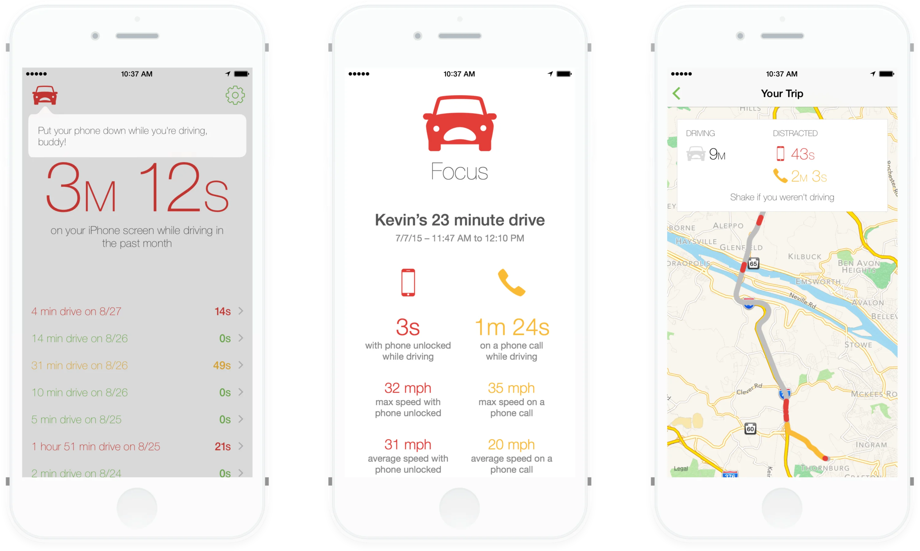
Focus was an iOS app to discourage people from using their phone screen while driving. In 2015, it spawned off of the work I was doing on Moment, my screen time tracking app that helped millions become more aware of their phone usage habits. While Moment tackled the broader issue of phone addiction and daily screen time, Focus zeroed in on a specific and dangerous context: using your phone while driving. As fraught an issue as phone addiction is, there is no physical harm that comes from too much screen time. However, when you’re behind the wheel and using your phone, you’re putting many lives at risk.

Focus worked by automatically detecting when you started driving. If you picked up your phone, a voice would come over your speaker asking you nicely to put down your phone. If you didn’t comply, that voice would get angier and more sarcastic. Here is how that sounded:
- 😕
- 🙄
- 😡
Yes, that was my voice. Embarrassingly, those clips among others were played millions of times to the 42,000 people that downloaded the app.
In 2018, I shut down Focus to focus (har har 🙊) on Moment, which had grown to millions of customers tracking their overall screen time habits. Focus just never quite caught on. My suspicion is that most people — myself included — unfortunately didn’t see their own screen time while driving as a problem. “I’m a good multitasker, I don’t need an app to fix this habit.” However, the one market where this app succeeded was parents of teenage drivers. It was a great way for parents to keep their kids accountable and a little safer on the road.
My Role
- Design
- Swift
- Ruby on Rails
I worked on Focus by myself and ran all aspects of its operations. I handled the system administration, backend development in Ruby on Rails, frontend design, and iOS coding in Objective-C/Swift. I handled all of the business side and customer service, and I was even the voice actor. 🙈
What I’m Most Proud Of
The invisible interface. Once you installed Focus, you never needed to tap into the app again. The app would work automatically and entirely from the background, even given the strict technical constraints of iOS.
You would start driving, and Focus would detect that automatically. If you picked up your phone during that trip, it would play the audio reprimands. The main interactions with the app were the audio and some notifications.
If you were a passenger, Focus wouldn’t know that right away and would lightly scold you for using your phone. But, a simple shake of your phone would mark yourself as “not driving.” Even that action didn’t require you to open the app and didn’t need any UI at all!
To me, the invisible UI was quite handy for an app designed to lower your screen time while driving. It was difficult to build, but it was the perfect interface experience for an app that’s meant to be used while you’re driving.